ThermalPlot
Visualizing Multi-Attribute Time-Series Data Using a Thermal Metaphor
Visualizing Multi-Attribute Time-Series Data Using a Thermal Metaphor
Multi-attribute time-series data plays a vital role in many different domains. An important task when making sense of such data is to provide users with an overview to identify items that show an interesting development over time. However, this is not well supported by existing visualization techniques. To address this issue, we present ThermalPlot, a visualization technique that summarizes complex combinations of multiple attributes over time using an item’s position, the most salient visual variable. More precisely, the x-position in the ThermalPlot is based on a user-defined degree-of-interest (DoI) function that combines multiple attributes over time. The y-position is determined by the relative change in the DoI value (ΔDoI) within a user-specified time window. Animating this mapping via a moving time window gives rise to circular movements of items over time—as in thermal systems. To help the user to identify important items that match user-defined temporal patterns and to increase the technique’s scalability, we adapt the items’ level of detail based on the DoI value. We demonstrate the effectiveness of our technique using two usage scenarios that address the visual analysis of economic development data and of stock market data.
Holger Stitz, Samuel Gratzl, Wolfgang Aigner, and Marc Streit
ThermalPlot: Visualizing Multi-Attribute Time-Series Data Using a Thermal Metaphor
IEEE Transactions on Visualization and Computer Graphics, 22(12), pp. 2594-2607, 2016.
Paper (PDF, 8.0 MB) BibTeX Citation
Poster IEEE InfoVis 2015 Honorable Mention Poster Award

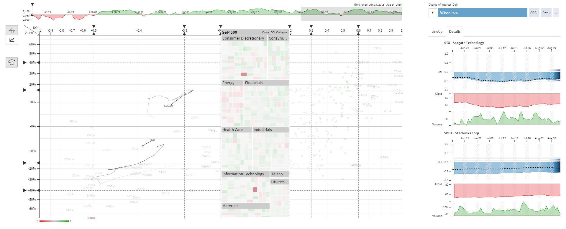
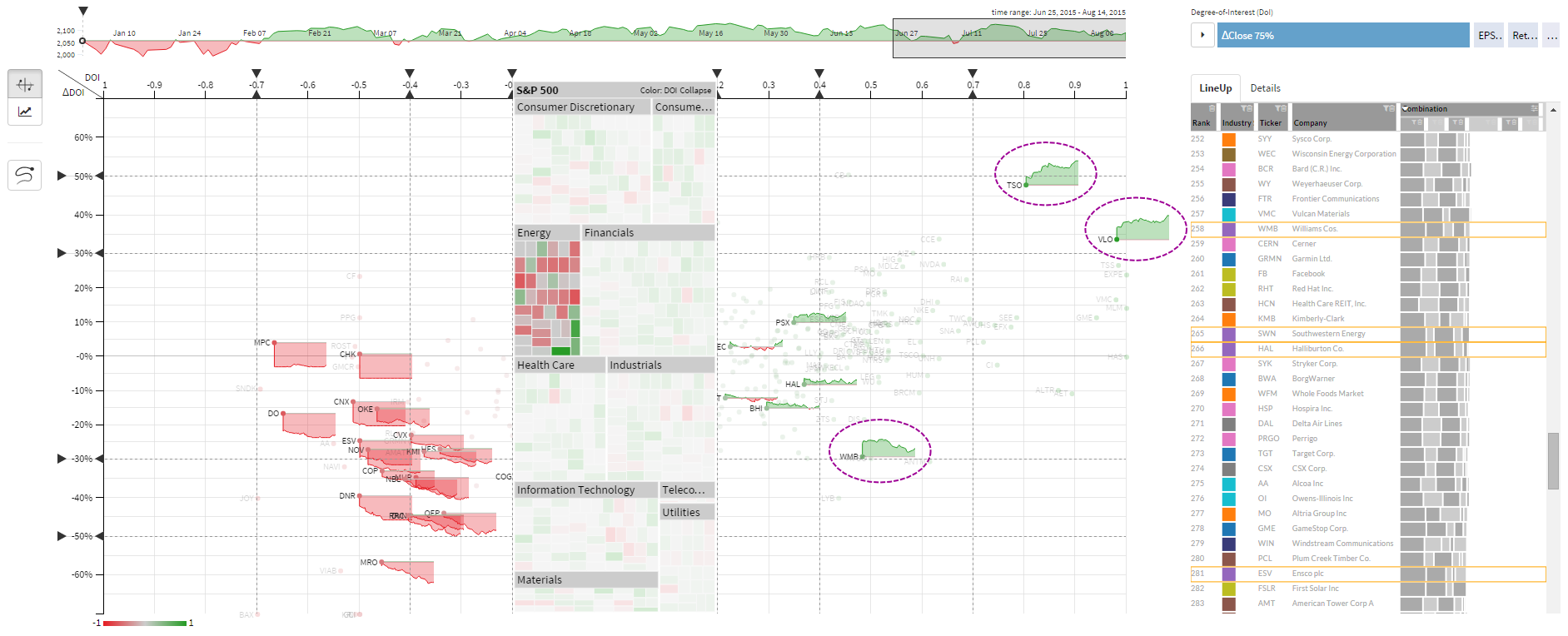
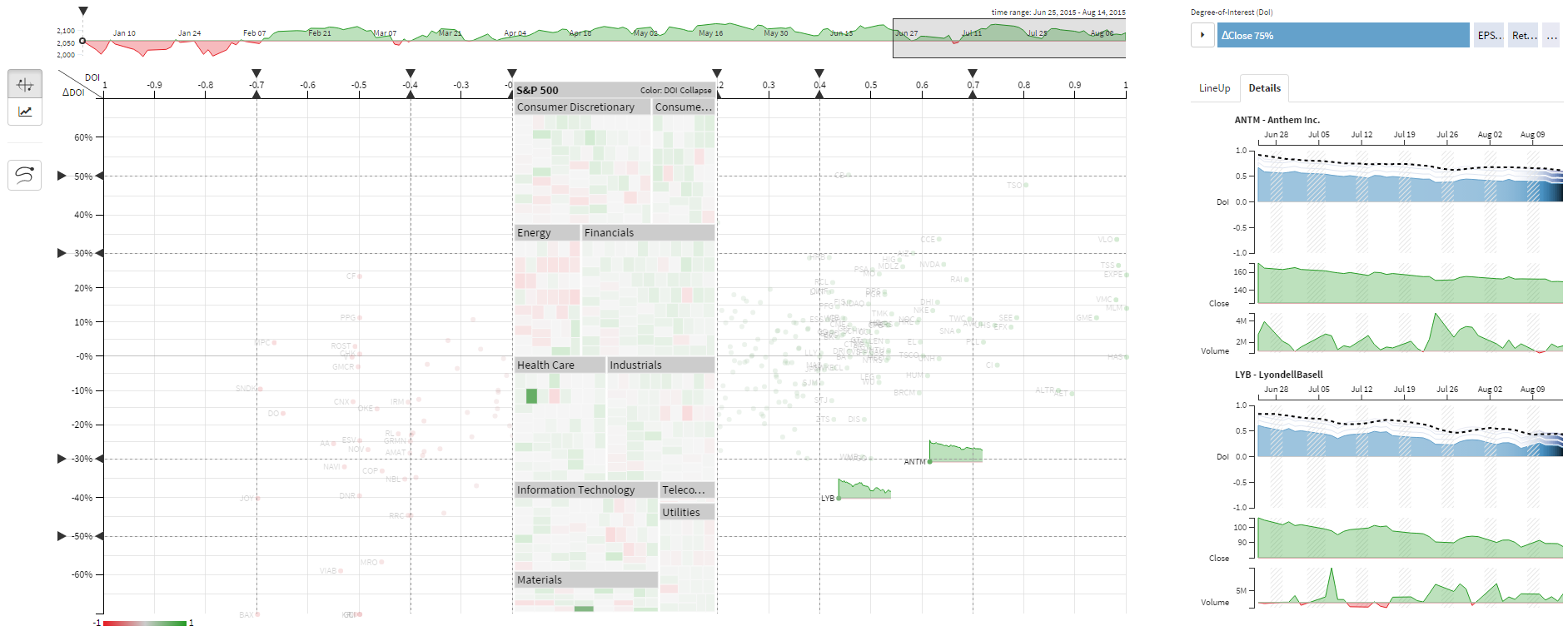
Compare stocks of the S&P 500 index with a daily updated dataset.
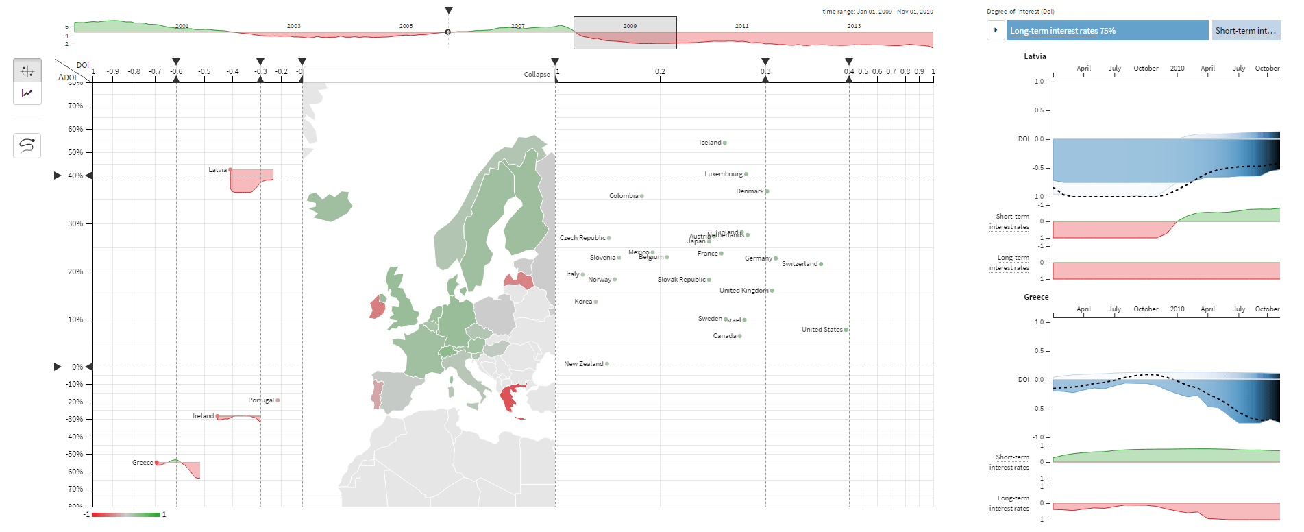
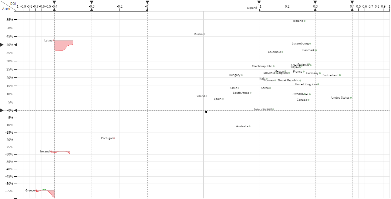
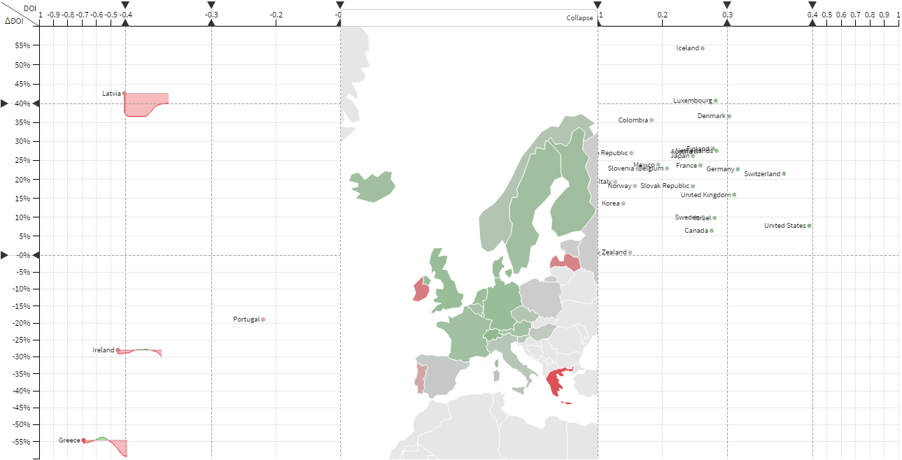
Explore how Latvia overcame the financial crisis in 2009/2010.
The images are taken from the paper. Click images below to see the large version.
ThermalPlot Visualization Concept
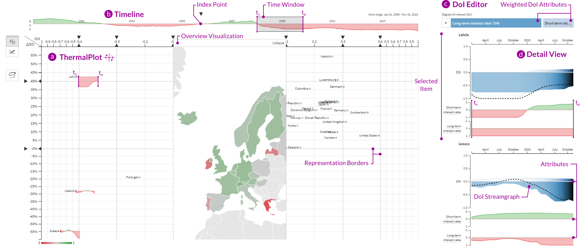
Integrated overview visualization
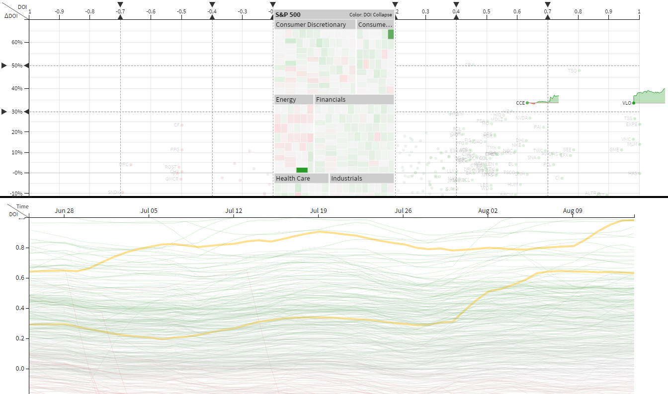
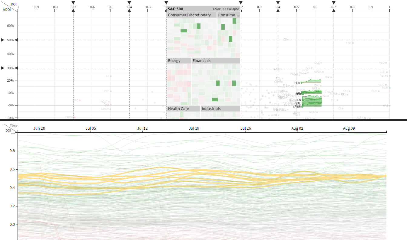
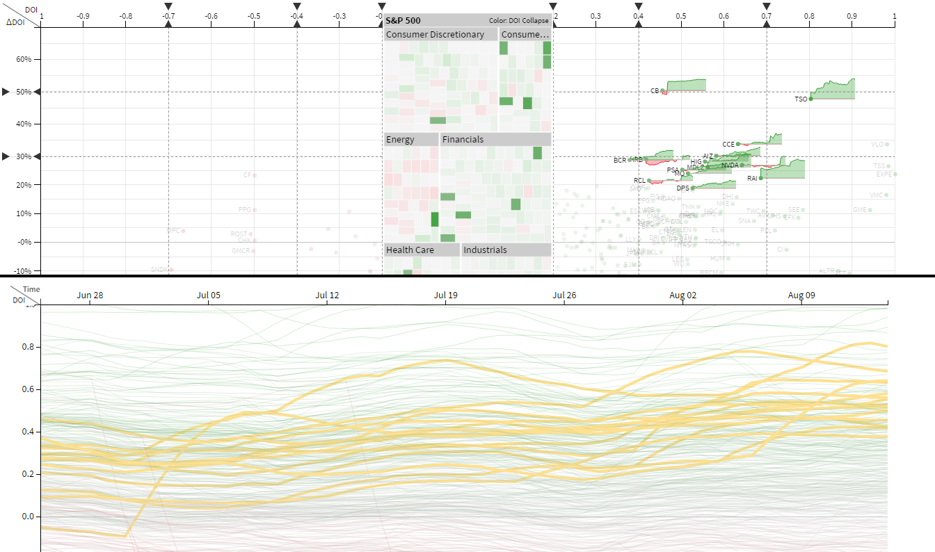
Stock Market Use Case
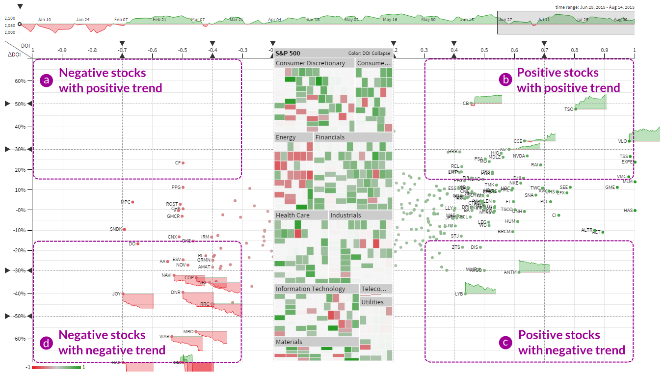
ThermalPlot vs. Line Chart
You can contact us, via holger.stitz@datavisyn.io.
This work was supported by the ICT of the Future program of the Austrian Ministry for Transport, Innovation and Technology (BMVIT) via the projects PIPES-VS-DAMES (840232) and VALiD (845598) as well as the Austrian Science Fund (FWF) via the KAVA-Time project (P25489). The authors also thank Bernhard Elias for providing valuable input concerning the stock market usage scenario.